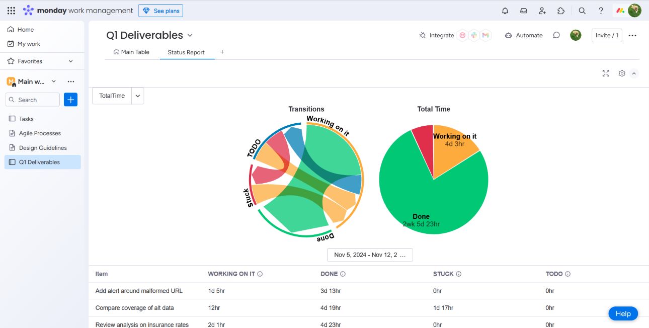
Status-Time is a workflow analysis toolkit with a focus on status time tracking and transition frequency analysis. It consists of a set of menu items and views that operate on multiple levels — individual tickets, groups of tickets, or an entire board — providing a flexible overview of workflow patterns.
Status-Time is accessed four different ways
Good project management aims to identify areas for improvement and keep teams focused on goals. Metrics involving status duration offer insights into potential bottlenecks and areas where tasks get "stuck." Metrics using status transition counts can highlight back-and-forth transitions or identify stages that often need rework.
All reports generated from Status-Time feature three key elements: a transition diagram, a total time pie chart, and a table section containing a per item breakdown. For all but the Single Item View, tables can be toggled between the two primary stats gathered: time tracking and transition counts.
Support only exists for reporting on a single status column. Multiple columns may be added in the future based upon user demand.
The "Transition" diagram is a weighted chord diagram. Each segment represents transitions from one status to another with the thickness of the arc representing the total number of such transitions. Hover over will give a small popup with the exact values used for that chord.
The "Total Time" pie chart is the summation over a 24/7 time period for each status rounded down to the nearest hour. If a status had no time or a negligible amount of time compared to time spent in other statuses then it will not be rendered in the pie chart.
Attention: If there is no activity over the time period then no chart will be rendered.
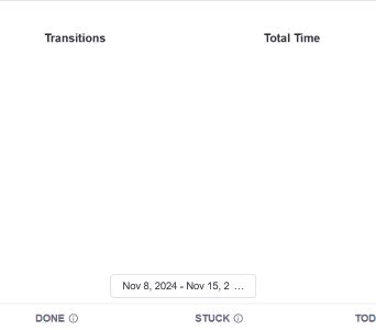
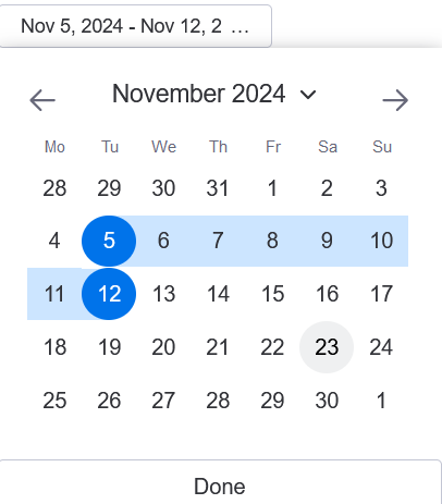
The calendar menu allows you, the user, to manually select a window in the past. The choice of dates is limited only by the monday.com plan of your organization. The default timeline is a 1 week lookback from today.
From the settings menu different default time periods can be chosen. Selecting a default exceeding your monday.com plan will not cause an error but will not return additional dates. A reference is provided here:
| Plan | Period |
|---|---|
| Basic | 1 Week |
| Standard | 6 Months |
| Pro | 1 Year |
| Enterprise | 5 Years |
If you would like to know more about plan types, see here
Calendar menu is oriented beneath the two charts.
Each report features two different tables, one to track total time spent in each status per item and the other tracking the number of times an item transitioned to a status. The default view total time spent in each status per item. The default status (empty/blank) is not tracked.
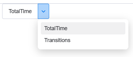
The table toggle switches the view between the two tracked metrics. It has no impact on the charts.
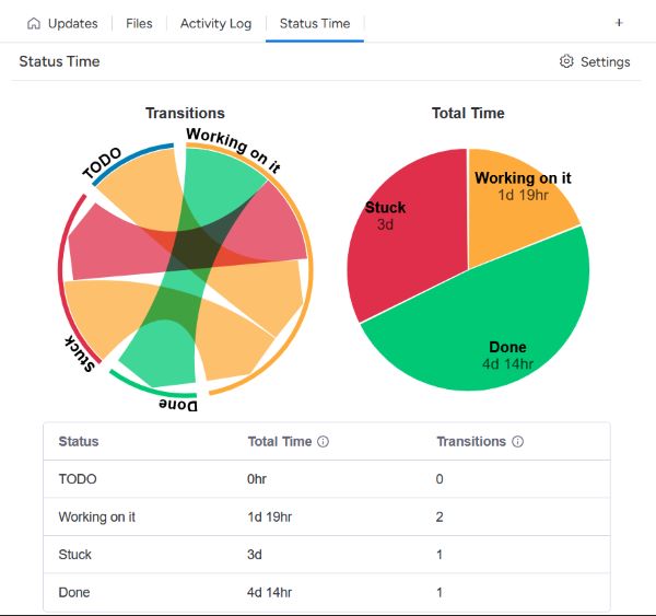
The Single Item View differs from all the other views in that it defaults to a period lookback at the maximum allowed for your plan. It also combines both tables into one, as there is but a single ticket under analysis. This view is availble in both the free and paid plans.
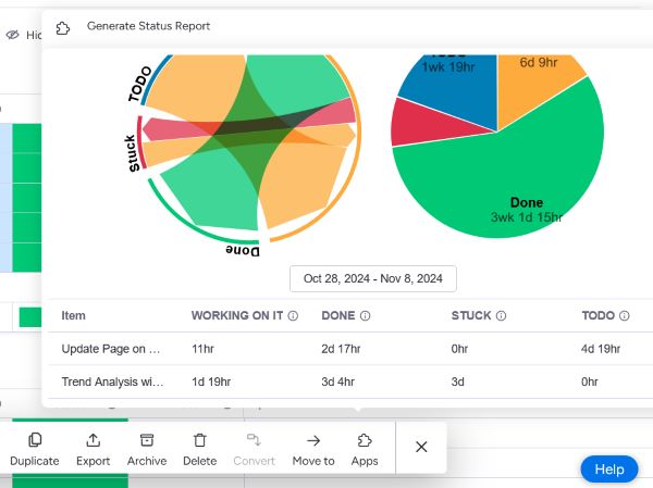
Both of these views are accessible from their respective menus. Group reports are best when attempting to examine how all items under that group (as seen from the board filter) are progressing for the given time window. The Multi-Item view allows for a more ad-hoc analysis with item selection available across groups. However, as with every else, they are constrained to a single board and are oblivious to items on other boards.